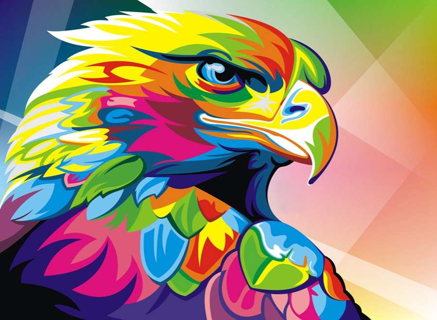
The number one thing to consider when designing a poster is how to make it stand out. Whether it’ll be on a wall amongst a hundred others or on its own but seen from a distance, a poster advertising your business or promoting your message will only be effective if it’s seen. One of the best ways to ensure that your poster is as eye-catching as possible is to use colour. But which colours should you use in order to send the right message?
The number one thing to consider when designing a poster is how to make it stand out. Whether it’ll be on a wall amongst a hundred others or on its own but seen from a distance, a poster advertising your business or promoting your message will only be effective if it’s seen. One of the best ways to ensure that your poster is as eye-catching as possible is to use colour. But which colours should you use in order to send the right message?
One of the first things is to understand which colours work well together and which don’t, which is where the colour wheel comes in. This pictorial demonstration of colour showcases primary, secondary and tertiary colours in a way in which allows you to easily see what colours work well together.
Primary colours, as you may know, are red, blue and green. Secondary colours are those we get when the primary colours are mixed together – so purple, orange and green. Finally, tertiary colours are those you get when a primary colour is mixed with a secondary colour in a ratio of 2:1. Neutral colours including grey, black, brown and white don’t feature on the colour wheel but should always be considered for use.
The colour wheel shows warm colours on the right and cooler colours on the left. Contrasting colours, those on opposite sides of the wheel to one another work well together on a poster as they stand out against each other making your poster more visible.
Remember not all colours work for all aspects of a poster - colours such as yellow should be avoided when considering the colour for your lettering as it can be a very hard to read.
Next you need to consider what symbolism the audience is reading into the colour you have used and for that you need to explore the psychology of colour a little. Here are some of the words associated with some of the most popular colours:
Consider the message you want your poster to convey and choose colours which reflect it.
In a survey looking at 100 of the biggest brands in the world, there were found to be some recurring themes in the main colours they consistently use in their branding and advertising.
Primary colours were popular with 33% using blue as their main colour, 29% using red and 28% using either black or grey.
While colour will help to make your poster stand out too much of it can be confusing. Try not to use too many colours within one design.
Finally, to ensure your poster truly stands out it will need to be perfectly printed with crisp lines and strong, vivid colours. We have a range of large-format printers ideal for printing posters onto a wide variety of materials.
We're here to help. Whether you're looking to get started with a large format printer or you've been in the industry for years, our team of qualified specialists are always happy to lend a hand. Give us a call on 0845 680 9000.
Our doors are open from 9am to 5.30pm Monday to Friday, but you can drop us an email at anytime and we'll get back to you as soon as we can.
Contact us
ADDRESS: 12 Salisbury Road, Bromley, BR2 9PU
Sales: 020 7064 9660 | Support: 020 7064 9663
Get support
Plotter and Printer supplies
Helpful links
Accreditation


Perfect Colours Ltd is a Limited Company registered in England and Wales. Company Number: 03782325. Perfect Colours Ltd is VAT Registered. VAT Registration: GB739735490. Copyright© Perfect Colours Limited, All rights reserved.

